
Your AI SEO Website Auditing Checklist
It’s not just humans that use search anymore. Artificial intelligence plays a huge role in…

Did you know that in 2021 mobile eCommerce is due to overtake desktop eCommerce for the first time ever? The race is still quite close, roughly 50/50, but the sharp rise in the use of mobile devices (mostly smartphones, but also tablets) has been very steady over the last few years, and it’s projected to continue growing throughout the 2020s and beyond.
It’s difficult to accurately predict the future of tech. In technology, anything over five years old is considered fairly ancient. Anything over ten years old is practically a museum piece, but all that means is that we need to keep on top of the changes and invest in the areas that will provide our businesses with the best return for our money.
Right now, that is in mobile and eCommerce optimisation.
Mobile optimisation is a broad term to describe making the experience of visiting your business better for people using mobile devices, and it covers a huge area.
Back when the web was first invented, and HTML became the standard (not that long ago, the 1990s!), websites were very text-based, and the coding behind them fairly basic. Due to slow internet connectivity and the relatively high cost of imagery, web design was quite fixed and static.
Jump ahead 30 years and the internet has evolved at lightning pace, with mobile responsive websites more in demand than ever.
Where mobile optimisation comes in is ensuring that your website looks good across devices and across screen sizes. Travel back a few years, and there were only a handful of screen ratios, from the standard mostly square ratio of 4:3, right through to the more popular ratios of landscape and vertical (16:9 or 9:16).
Why are ratios more important than pixels? In traditional web design, there are (broadly) two ways to display an element on your website, either in pure pixels (a picture might be 300px by 200px, for example) or in percentage, where you may decide you want your picture to take up 25% of the width of the screen. For mobile responsive websites, neither of these two options is ideal because different screen sizes will dictate where the content is placed on a screen.
Therefore, mobile eCommerce optimisation from a web design perspective means being more flexible and adaptive with the design of our mobile pages whilst still keeping to the look and feel of our brands and our brand vision.
A mobile optimised website is a website that works just as well on mobile as it does on a desktop, and with almost half of all traffic now coming from mobile devices, it is absolutely vital that we move away from standard eCommerce website builders towards more responsive mobile sites to cater for this rise in mobile traffic.
It’s not only the smartphone users we have to think about either. Every day Google’s algorithm gets more and more clever, and they (along with all other major search engines) are now looking towards a mobile-first future. It’s not even new news. Google specifically moved to a mobile-first concept back in 2018, and now optimising your site’s performance on mobile is a critical ranking factor in eCommerce search engine optimisation.
For commerce sites, this is even more of a worrying time. Abandoned carts are a headache for many business owners, and you might feel like you’ve worked exceptionally hard to create a mobile-friendly site only to see, like everyone else is currently seeing, abandoned cart notifications being a LOT higher from mobile devices than from desktop.
A lot of this has to do with current user behaviour. Many people prefer to buy in a slightly more formal setting, such as from their laptop, and because of the expectation that businesses will have a dedicated app instead (think eBay, Amazon, Wayfair, etc.).
Some of this low mobile eCommerce conversion rateA conversion rate is the percentage of visitors that take a desired action on your site. does have to do with the lack of decent eCommerce website optimisation for mobile, and dealing with that is what we’re going to tackle below.
If you’ve come this far, you’ll now be wondering how to optimise a website for mobile and improve your eCommerce conversionA conversion is a desirable result on a website that leads to an action such as completing an order, filling out a form, or simply clicking on a link. rate optimisation for mobile-friendly browsing and commerce. Mobile SEO optimisation is a big task, and it is recommended that you walk through the changes you’d like to make with a professional to ensure that your website meet’s the standards.
To give you an idea of what areas to look into, we’ve broken it down into five simple aspects of a great website: site speed, safety, clutter, faff, and navigation issues. If you tackle and improve each of these areas, you are already a fair way down the road to a better optimised mobile commerce site.
In today’s short-attention-span world, page speed and load times are the number one complaint from mobile users. Pages that take over 3 seconds to load are abandoned most often by users, even if your content is really good and your products are exactly what they want.
There are various ways to speed up your page, and you should start by using Google’s free tool dedicated to showing you how your website compares.
Broken JavascriptJavascript is one of the web’s key programming languages but coding it incorrectly can cost you in technical SEO terms. In order to avoid common mistakes, and understand how Java operates, here’s a quick guide to coding Java the right way., out of date PHP, huge images, and badly coded plugins can all add up to a slow loading website and lost sales for you.

If your website is nice and speedy but it doesn’t feel secure, your users will drop off very quickly.
Security is a BIG issue for users these days, especially with online fraud being so high. Many users even visit websites via a VPN when they are out and using public wifi, just to be on the safe side.
How does a website look more secure, you ask? This comes down to two factors: how professional your site looks and how your user is expected to check out.
If your website looks poorly built, or it’s full of clutter (more on that below), it will immediately raise alarm bells with users. When users want to check out of your site and make a purchase, they need to feel that they are checking out securely.
At the very minimum, you’ll need a security certificate to encrypt your user’s data, but to show that your site is a safe place for your users to hand over their credit card details, but it’s also worth investing in a secure payments system on your eCommerce platform. The most recognised of these is PayPal, and most users will be much happier to check out with PayPal, but other options such as Sage Pay could be the way to go too.
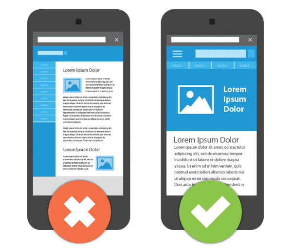
Clutter can be hard to define on a website, but the bottom line is: if your website looks messy, users won’t stay.
By messy, we mean websites that just haven’t adhered to good design strategies and don’t put the user experience first. If you have lots of pop-ups (yes, even those “join my mailing list!” pop-ups) that cover the page, garish colours, flashing gifs, or images (especially poor-quality images) that squash words along one side three letters at a time, your site is cluttered.
There’s also a consideration to be made on the text-to-image ratio. There is no right answer here, and it depends on the page. For an eCommerce page, you’ll want it to be (high-quality) image-rich and word thin, but if you have a page that is more of a blog style, for example, “how to use product X” or “why product X is vital”, then you’ll want to be word rich and image light. Approximately one image per 500 words is usually the ballpark, but that is a very loose guideline.
We could have used plenty more professional words to describe this annoying habit of website owners, but ‘faff’ (the word used to describe the ineffectual activity) seemed to be the perfect description for those websites that we all visit that just seems to waste our time!
You know the ones, the websites that insist on you filling in a 20 question form before you can create an account just to buy a one-off product, or the one that has the ‘add to cart’ button that navigates you away from the page you were on and doesn’t let you get back there easily? That really irritating eCommerce website that lets you put everything in your basket, head to check out, then insists you create an account which wipes your basket in the process? Or how about those websites that insist on you making an account, verifying your email, the confirming via text message that may or may not ever turn up?
That’s right, the more ‘faff’ your users have to put up with just to buy your product, the more likely it is they will abandon their carts.
For best results, have an option where your users can check out without an account, but suggest (with a list of benefits and promise of no spam) that they may wish to create an account to track their order on the thank you page.
The last on our list is navigation issues. It can be argued that all of the above fall into navigation issues, but sometimes it’s just the pure user journey that can be disrupted and annoy potential buyers so much that they don’t want to continue.
The best way to fix navigation issues is to make it as easy as possible for users to buy from you. Have a buy button stuck to the product page, keep your main navigation menu available at all times, and correctly categorise your products so that users can go back and find more great purchases!
mCommerce and eCommerce SEO are quickly becoming big businesses. If 2020’s global health crisis has taught us anything, it is that diversifying our businesses and being more accessible online is a great strategy to ensuring success, and with more and more people using online shopping and mobile shopping, you want your business to survive as well as thrive.
Contact our SEO services team today to get professional help improving your eCommerce conversion optimisation for mobile, and see the results for yourself in 2021!

It’s not just humans that use search anymore. Artificial intelligence plays a huge role in…

When a Google core update is being rolled out, digital marketers everywhere eagerly wait to…

Seasonality can have a huge effect on the success of your business. It is imperative to have a strong digital marketing campaign during periods of high consumer demand.

Budgeting for SEO is a terrifying prospect. There are so many elements in play, and seemingly endless considerations, rendering it…

Find out the secret code of how to get a rich snippet in Google.

Simply appearing on a search page isn’t enough anymore, not in today’s world driven by…
Follow vs nofollow links have been debated in digital marketing for years. Questions are often…

Citations are a long-standing SEO trust signal that helps increase visibility in local search results…

In 2026, digital PR services are essential for any brand wanting to build lasting authority…
Picture this: you're working at an SEO agency, managing multiple clients and delivering strong results…
You may have heard that Google has rolled out a notable new update: the February…
Search is evolving quickly. Large Language Models (LLMs) and Google AI overviews now have a…

Automation is on the rise in just about every industry, and SEO is no exception…
If you are looking to increase your traffic, sales & leads, let's have a chat!
The team will usually respond within 1 hour.